 Nov 9, 2022
Visualize user feedback with unitQ Charts and Dashboards
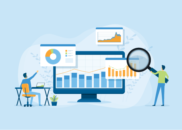
Despite being a well-worn cliché, the notion that a picture is worth a thousand words is a true one. Visuals are a great way to quickly and easily tell a story in a very succinct way. That’s why we’re very excited to release unitQ Charts & Dashboards!
Charts consolidate your feedback into a single source of truth that is dynamic and reflects your business in real time, giving you a comprehensive perspective of user feedback. They improve decision making by providing you with a deep and personal understanding of your users’ needs along every touchpoint of the customer journey.
Because the experience your organization is delivering is constantly changing, these new visualizations also are customizable so you can take snapshots of any time period that might be pegged to platform changes, new releases, promotions, or any other factor. This enables organizations to visualize user trends to ensure their products and services continue to exceed user expectations.
At their core, charts enable CX, product, and engineering teams to easily build presentation-ready visualizations of user feedback trends. You can identify emerging patterns with advanced filters and export those findings — and dive deep on products, regions and user segments.
For example, create charts for recurring assessments of the KPIs your team cares about the most. You might want to visualize the top 10 reasons your Android app is getting 1- or 2-star reviews. Or, you can break out your unitQ Score by language and see how your app ranks based on the language your users are speaking.

Charts are also a fast way to conduct ad hoc deep dives into emerging user experience trends. You might simply create a chart to learn why you had a sudden spike in feedback, at any given time.
A variety of charts are available. Choose from column, bar, donut and line. Use whatever chart is most suitable for what you are trying to visualize — for example, rendering a line chart to compare two metrics over time, or a donut chart to visualize how metrics stack up against one another.
We also created a number of default charts for faster deployment. These out-of-the-box charts enable you to illustrate your unitQ Score by platform, view feedback trends by sentiment, highlight top reasons for poor app store ratings, and more.
Dashboards for visual analytics
Dashboards bring visual analytics to unitQ. They are a series of charts aggregated on a single scrollable page. Use dashboards to track release performance, product sentiment and more.
With our dashboards, you can monitor as well as easily share a wide variety of your organization’s user experience metrics. Dashboards make monthly executive reporting as easy as sharing a screenshot or link.
You might also share dashboards to rally your team or other teams around a set of key user experience metrics. For example, the support team might want to share a dashboard with the engineering team showing the top reasons for poor app store ratings — drilled down to the latest product release.


You can build your own dashboards or leverage default unitQ dashboards, including snapshots of your Android and iOS performance. Each is built from a number of default charts.
Get Started
If you want to learn more about how unitQ Charts & Dashboards enable organizations to visually stay on top of what matters the most to their users, then book a demo today!
Pete Bratach is unitQ documentation manager.